
Choosing a neutral paint colour should be easy, shouldn't it? After all, how many shades of beige can there possibly be? Well, quite a few, as it turns out! From warm creams and soft taupes to those mysterious greiges, finding the perfect neutral can be surprisingly tricky. But get it right, and it can completely transform how a room looks and feels.
Let's talk about beige. And cream. And taupe. And greige. And all those other wonderful shades that look almost identical on a paint chart but somehow completely different once you've got them on your walls. Because here's the thing. Choosing a neutral paint colour should be easy, shouldn't it?
You're not exactly being adventurous. You're not painting your sitting room bright orange or committing to a deep purple dining room. You're just choosing a nice, sensible neutral.And yet, three weeks later, you've got seventeen tester pots, approximately forty paint samples stuck to the wall, and you're beginning to wonder whether you've completely lost the plot.
Sound familiar?
First Things First, Beige Isn't Boring
Somewhere along the way, beige developed a bit of a reputation for being safe, predictable and, dare I say it, a little dull. But I think that's terribly unfair. A beautifully chosen neutral can be one of the most effective colours in a room. It creates warmth, allows other elements to shine and gives a space that lovely, relaxed, pulled-together feeling. The trick is choosing the right neutral.
Because beige isn't just beige. There are warm beiges, cool beiges, pinky beiges, yellowy beiges, greenish beiges and those slightly mysterious shades that seem to change colour every time you walk into the room. And that's before we even start talking about greige.
It's All About the Undertones
This is where things get interesting.
Every neutral has an undertone. It's the subtle hint of another colour hiding beneath the surface, and it's often the reason a paint colour looks completely different in your home from how it looked on the little sample card. A beige with yellow or red undertones will generally feel warmer. One with grey or blue undertones will feel cooler. And some of those lovely earthy neutrals have a little green hiding in them. You might not notice these differences when you're looking at one colour on its own. But put two supposedly similar shades next to each other and suddenly one looks pink, the other looks yellow, and neither looks anything like you expected.
This is why I always recommend comparing paint samples together rather than choosing a colour in isolation.
And here's a little trick: hold your neutral sample against a piece of pure white paper. It can make those hidden undertones much easier to spot.
Warm or Cool? It Makes More Difference Than You Think
Now, I'm not suggesting every colour in a room needs to have exactly the same undertone. In fact, a little contrast can be a wonderful thing. But understanding whether your neutral leans warm or cool can help enormously when you're trying to pull a room together.Think about the materials you already have.
Warm oak floors, antique brass, natural linen and lovely old wooden furniture often sit beautifully alongside warmer neutrals.
Cooler greys, crisp whites, polished stone and contemporary finishes might work better with cooler shades.
Of course, there are no hard-and-fast rules. Some of the most interesting interiors come from mixing warm and cool elements. The important thing is that the combination feels considered rather than accidental. And if you're working with an older property, particularly one with lots of natural materials and character, I often find those softer, muddier, slightly warmer shades feel much more at home than anything too stark.
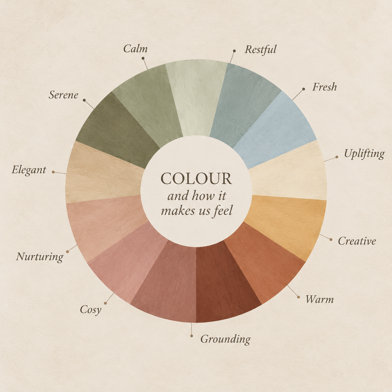
Don't Trust the Paint Chart
Well, not entirely. Paint charts are wonderful for narrowing down your options, but they're not particularly good at telling you what a colour will actually look like on your walls. And there's a very good reason for that. Colour is affected by everything around it.
The direction your room faces, the amount of natural light, the colour of your flooring, your furniture and even the colours in the adjoining rooms can all change how a shade appears. That gorgeous creamy beige you fell in love with in the paint shop might look distinctly yellow in your south-facing kitchen. And the sophisticated greige you were absolutely certain about might suddenly look rather gloomy in a north-facing sitting room.
Which brings me to my next point.
Please, Please, Test It Properly
I know. You've already spent hours looking at colours, and you just want to get on with decorating. But trust me, a little patience at this stage can save an awful lot of frustration later. Rather than painting tiny squares directly onto your walls, try painting large pieces of lining paper or sample boards. Move them around the room. Put them near the window, behind the sofa and next to your flooring.
Look at them in the morning, in the afternoon and, importantly, in the evening with your lamps on.A colour that looks beautiful at lunchtime might feel completely different once the sun goes down. And don't forget to look at your samples alongside the fabrics and finishes you're planning to use.
There's nothing quite like discovering your lovely new beige walls make your expensive cream sofa look slightly green.
The Secret to Making Neutrals Interesting
One of the biggest misconceptions about decorating with neutrals is that everything needs to match. It really doesn't.
In fact, rooms decorated entirely in one shade of beige can sometimes feel a little flat. The secret is layering.
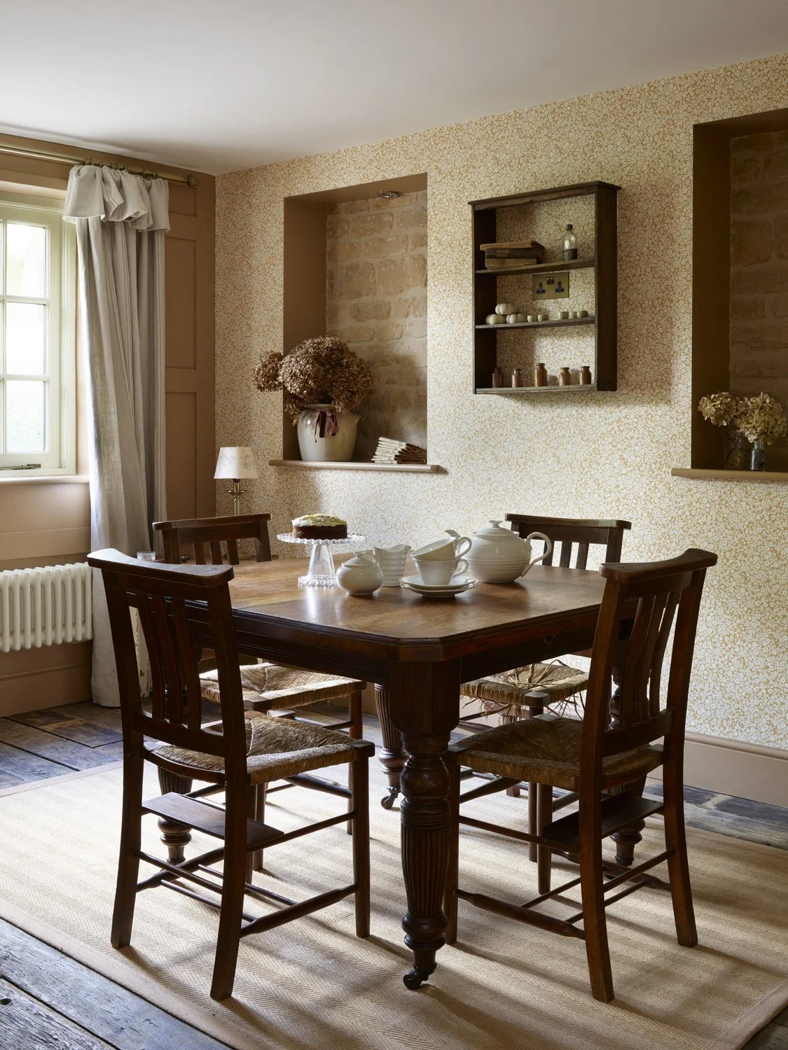
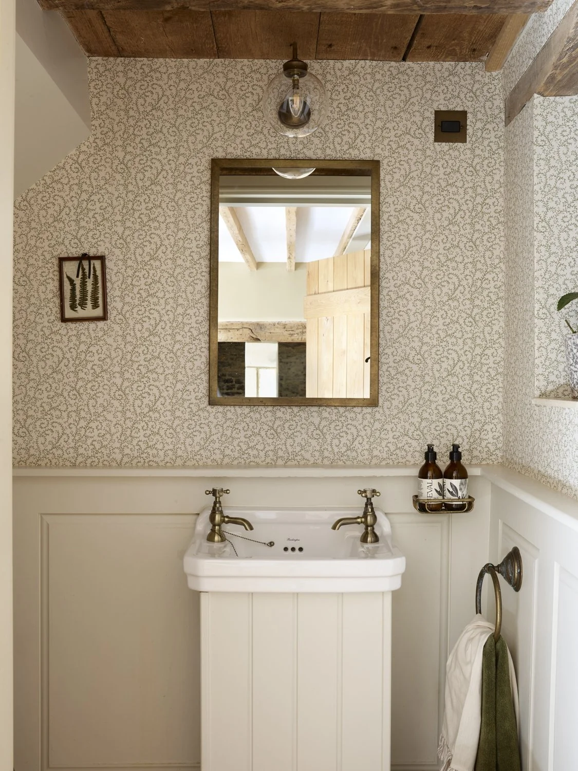
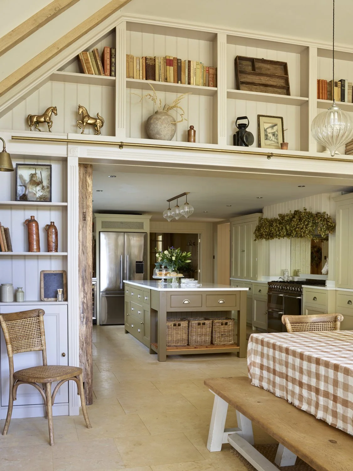
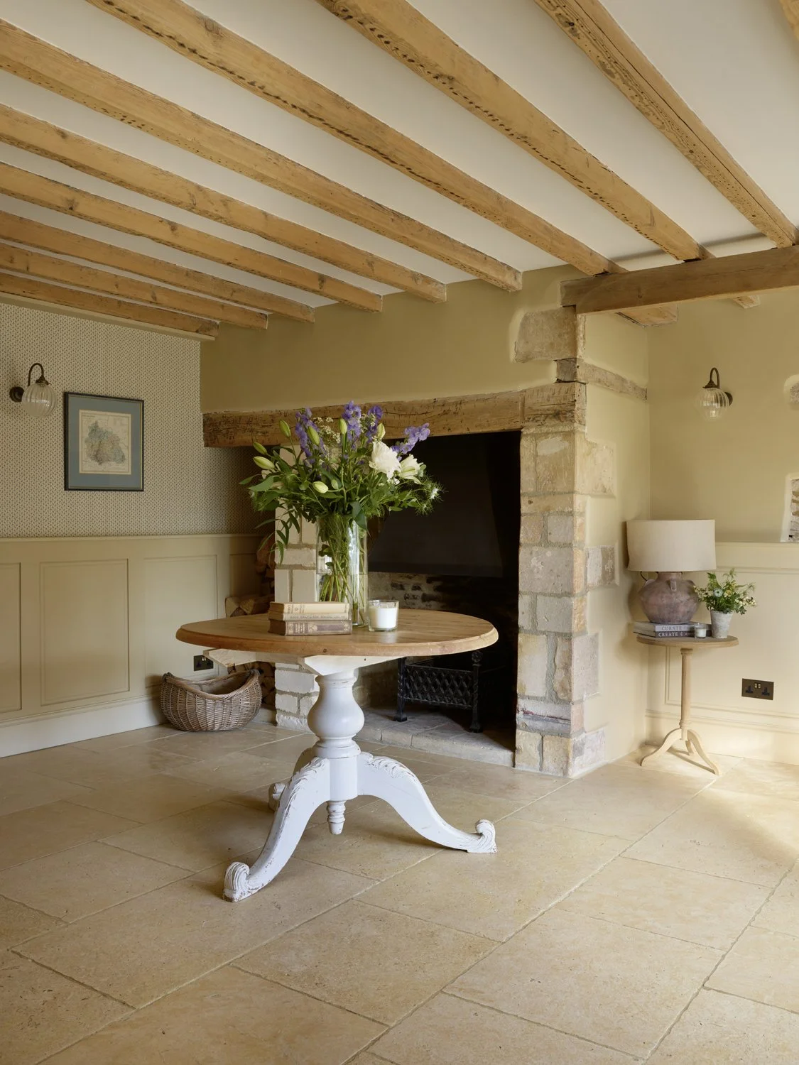
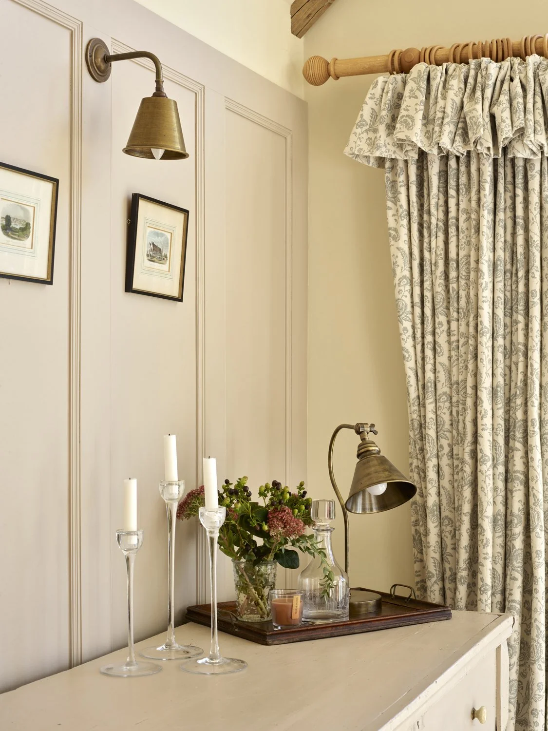
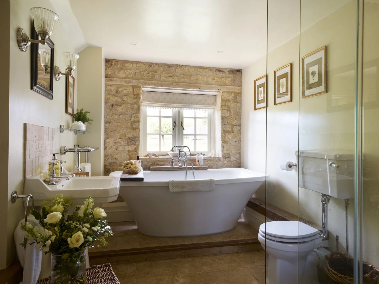
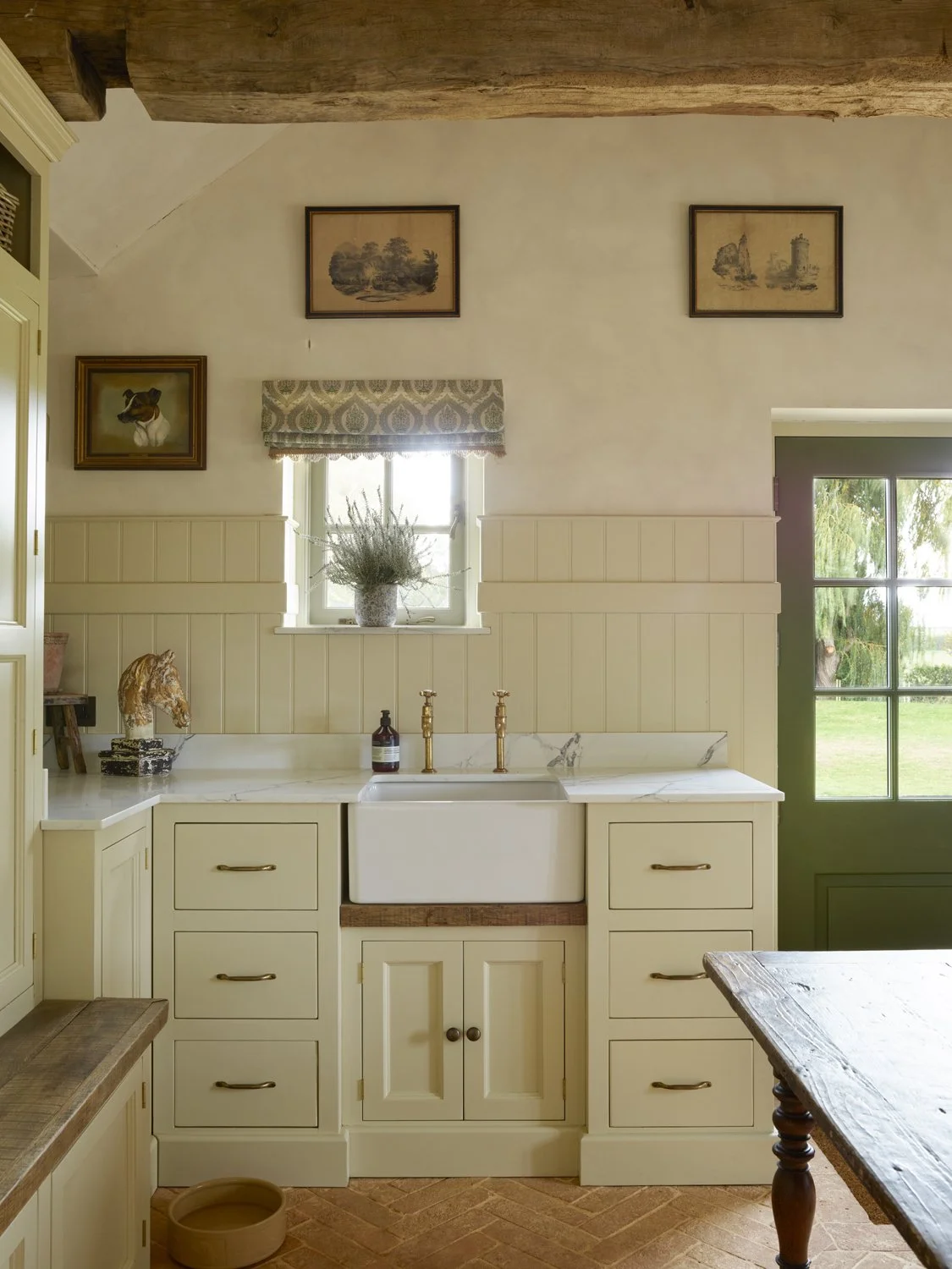
Think creamy linen curtains against warmer mushroom-coloured walls. A natural jute rug beneath a soft wool sofa. A little dark wood, some antique brass, perhaps a touch of olive green or a beautiful terracotta cushion. Suddenly, what could have been a very ordinary neutral room becomes something much more interesting.
Texture is particularly important. When you're working with a restrained colour palette, materials do a lot of the heavy lifting. Rough against smooth, matt against polished, old against new. It's these little contrasts that give a room depth and personality.
And the lovely thing about neutrals is that they give you the freedom to introduce colour elsewhere without everything fighting for attention.
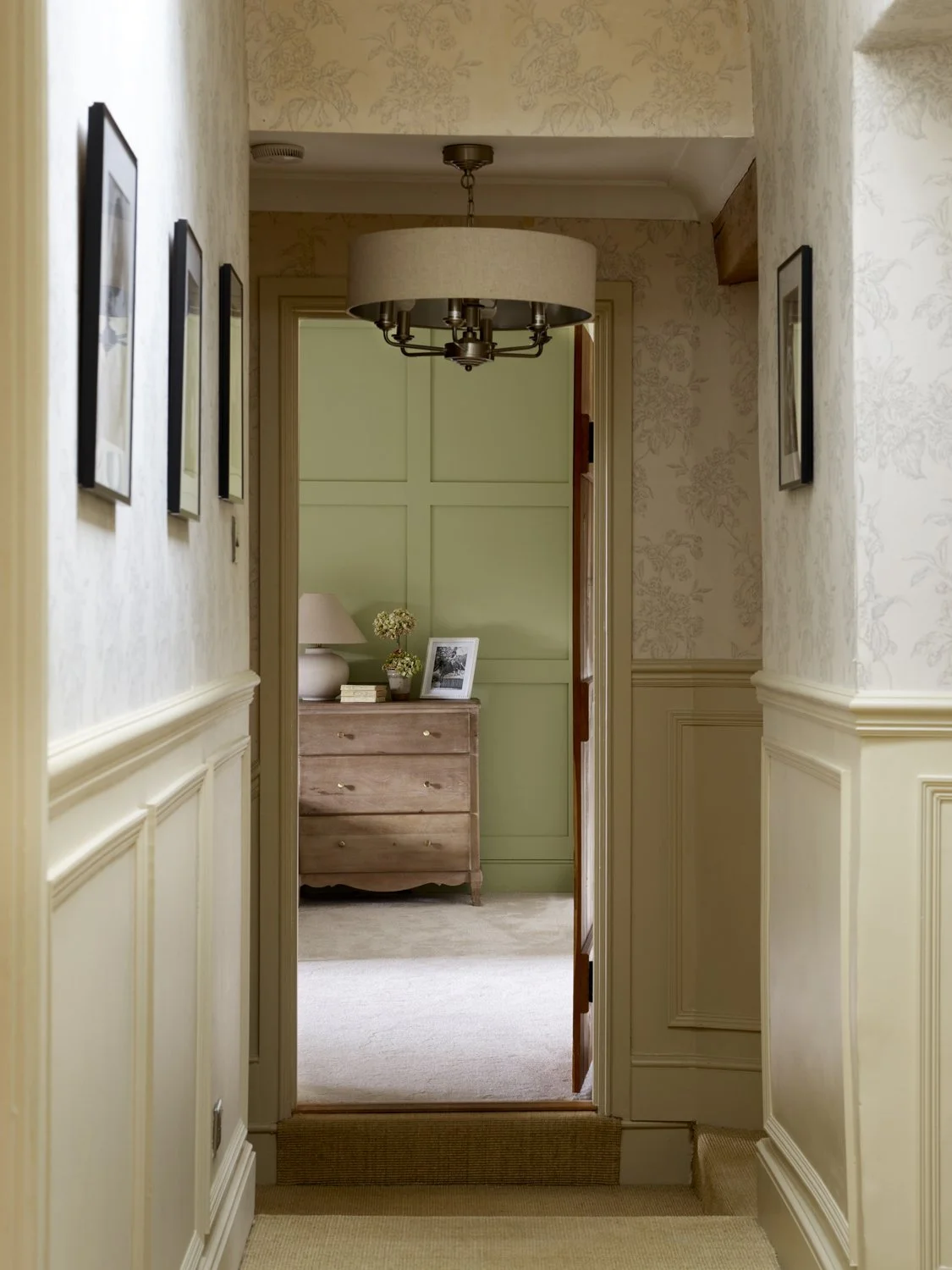
So, Which Beige Should You Choose?
Well, I'm afraid there's no magical answer. And anyone who tells you there's one perfect neutral that works in every room probably hasn't spent enough time looking at paint samples. My advice is to start with the feeling you want to create rather than the colour itself.
Do you want the room to feel warm and cosy? Light and airy? Calm and restful? Sophisticated and elegant? Then look at the furniture, flooring and materials you're keeping, and choose a neutral that works with them. Don't be afraid to try something a little muddier, darker or warmer than you originally imagined.
Sometimes the shades that look least exciting on a paint chart turn out to be the most beautiful on the walls.
One Last Thought
I've always believed that the best interiors aren't necessarily the ones with the most adventurous colour schemes. They're the ones where everything just feels right.
And sometimes that means choosing a beautifully understated neutral and letting the furniture, textures, artwork and little details do the talking. So, if you're currently surrounded by paint samples and wondering whether there's really any difference between beige number seven and beige number twelve, I promise there probably is. Whether anyone else will notice is another matter entirely.
But you'll know. And that's what counts.
Heidi x